Case Study: Morecast
Case Study: Morecast
A deep-dive into the product development process, from understanding the problem, milestones in the UX process, and the proposed solution.
Overview
Morecast is an enterprise application that creates a granular forecast based on data science models. Previously, this would be a manual time-consuming process using multiple spreadsheets and various communication tools. Now this same process can be accomplished quickly within one tool. Morecast's success has led to the organization creating a suite of tools for integrated systems and operation planning.
My Contribution
I was onboarded as the lead UX designer in the early stages of Morecast's development. As my team's only UX resource, I continued to lead the user experience throughout our product's entire development lifecycle, end-to-end.
ChallengeS
How can I quickly ramp up and communicate my ideas to the data analytics team without having prior experience or knowledge of data science?
How can we build a product with shifting requirements and priorities for users that have not been onboarded yet?
My Process
When I joined this effort, the team consisted of me and a data analyst. They created the data model, and it was my responsibility to create a product around it. There were very few requirements and without knowing exactly who our users were, I decided to facilitate a weekly requirement workshop with our stakeholders to ensure that I was building a product that aligns with business needs. Within a few weeks, we had some solid use cases that would need to be validated by users.
My UX research comprised of translating the business needs, use cases, and current state workflows into tentative user requirements. This gave a little insight into who our users would be and what they would need to be successful in this new workflow. I also researched other tools in and outside of our organization that built a UI around complex data models and used comps to get feedback from stakeholders and data visualization SMEs.
In my research, I found data, feedback, or documentation on:
How would our users think, feel, and act during each part of their workflow?
What are similar products doing right? Where are there opportunities for improvement?
What are examples of successful workflows?
What are the best ways to present data?
What are the preferred methods for interpreting data?
Once I had a good grasp on the data we had and the goals our stakeholders needed to accomplish, I started creating and iterating on user flows and wireframes. And at times, even using these assets during our workshops to help guide conversations.
Iterative User flow
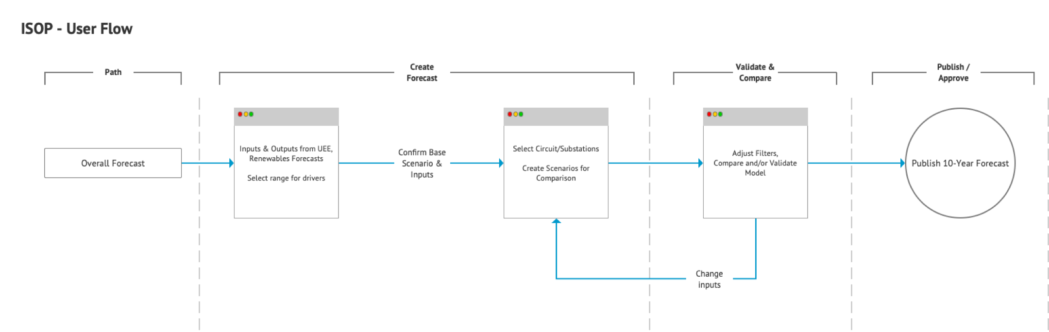
The first iteration of user flows was based solely on the data we had. From the data, we could create a forecast, validate a forecast, and publish the forecast.
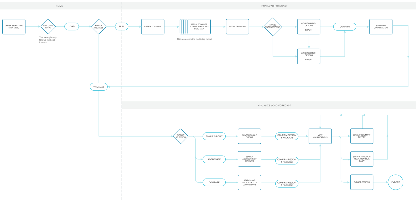
Using our workshop with stakeholders we were able to shed more light on user processes that would need to be incorporated into the new tool. The second iteration, our MVP user flow, takes the main concepts from the first iteration, creating a forecast and validating a forecast, and expands on them for a holistic workflow for our users.
Incorporating Feedback into Wireframes
Feedback was one of the pillars of success for Morecast. In the wireframes above, we focused on a specific goal: validating a forecast. In Version 1, the initial requirements were that a user needed to visualize a forecast and be able to easily identify peaks/mins. I created this wireframe during our stakeholder workshop and made changes on the fly as stakeholders discussed what needed to be accomplished in this part of the process.
In our next working session, the stakeholders came back with feedback that users would need to assess other criteria when validating a forecast. I incorporated that feedback directly into Version 2 during our session, indicated by annotation 3. I also pulled the peak/mins (annotation 2) into this version by having different views of the data. Based on my research, average users appreciated have multiple views of the same data to easily spot anomalies. Current state processes also indicated that users viewed available data from different perspectives.
After demoing Version 2, we received feedback about the views and filters taking too much real estate on the page, and making the forecast data the primary focus. In Version 3, I simplified and shifted some filters to the left side of the visualization and the most used filter was relocated to the top-right filter (annotation 3). I also displayed the peak/min view below the main visualization in response to stakeholders wanting to compare it to the forecast data.
UI Design - MVP
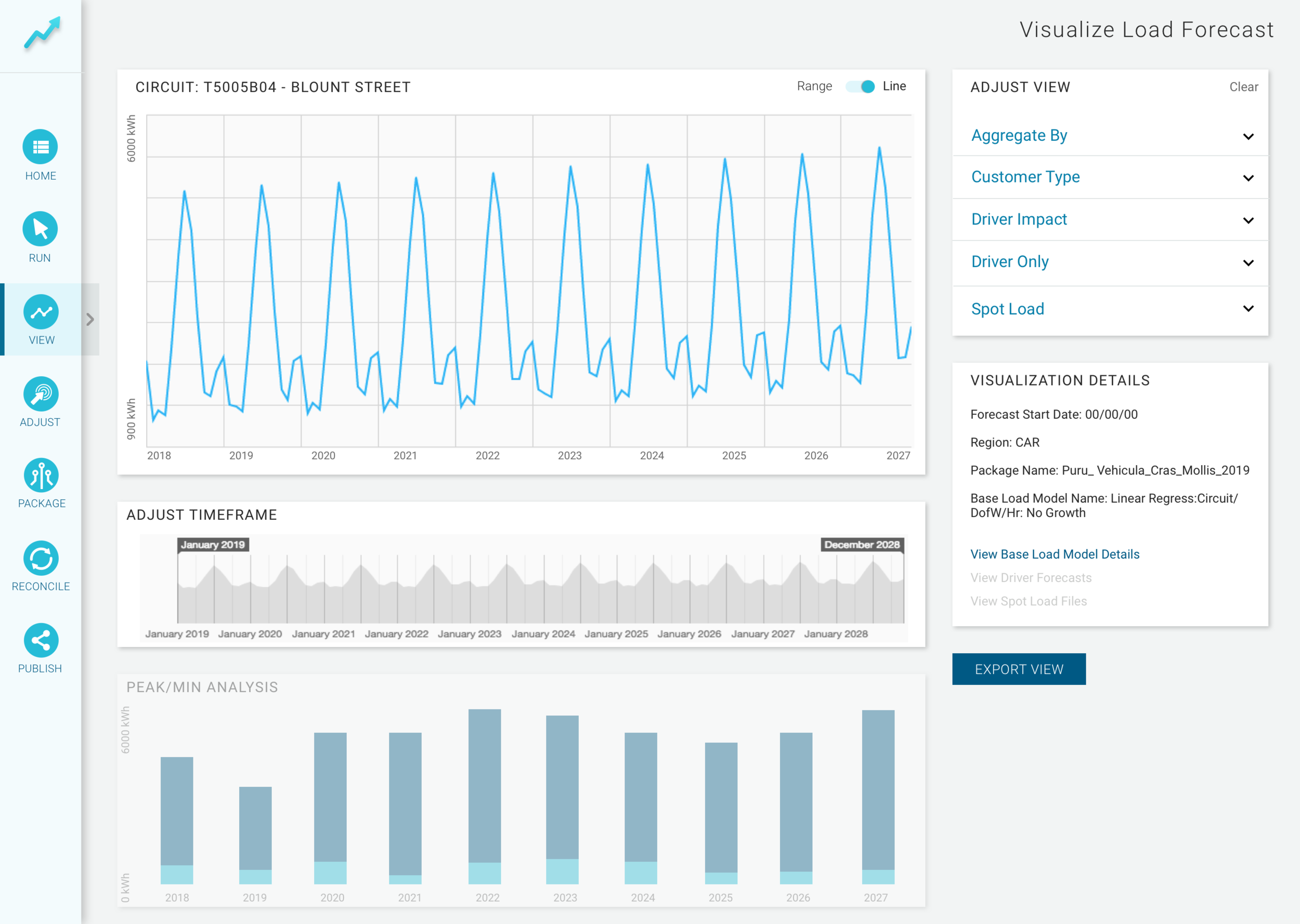
For our MVP, I was able to focus on our goals of creating and validating while still creating a robust application. The design here is based on the Version 3 wireframes, with the addition of the time adjustment functionality and left-side menu.
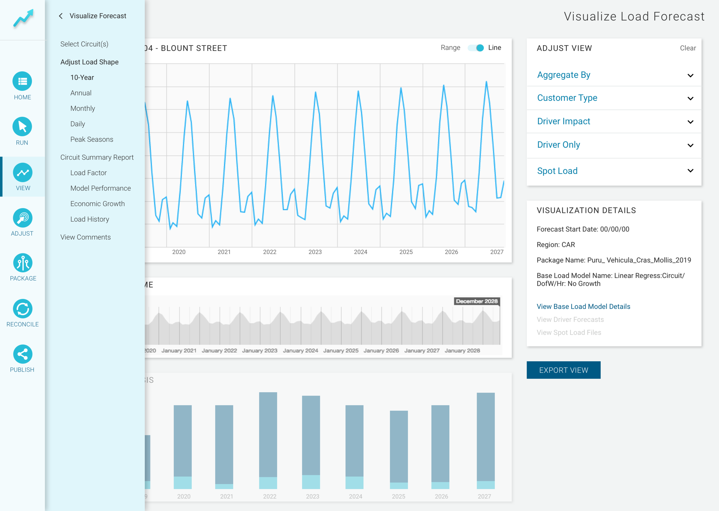
The menu is minimal, housing the starting points for our happy path actions (i.e. selecting an energy type, running a new forecast, view the data to validate), and giving enough space for data visualizations and adjustments on the left. There is also a sub-menu that slides out from the main menu to offer more options for users in their workflow and gives us room to scale the application for other features and functionalities.
Typography, icons, and color scheme were based on brand and style guides to ensure that it looked and felt like a Duke Energy product.
Testing, Feedback, and Feature Enhancements
After launching our MVP, onboarding users, and conducting user testing I was happy to report that Morecast was well received and adopted quickly by the new forecast team. Users gave positive feedback on their experience using the MVP.
"This tool streamlines our process drastically. What could have taken weeks, now will only take a few days and fewer meetings.”
“It's easy to use and helps me understand the insights clearly. I can't wait to see how it evolves."
And some critique, ranging from accordion icons (plus to carat) to additional info which we quickly added to the backlog.
"I wish there were more information and more ways to look at the data."
Over the next year, we would amplify Morecast's features and data models. The mockup included here shows the growth from MVP to the current state taking into account our users' needs to see more and do more all within the app. The minimal menu and sub-menu proved useful for scalability and simplicity as features get added to this enterprise application.